Unlock the Editor’s Digest for free
Roula Khalaf, Editor of the FT, selects her favourite stories in this weekly newsletter.
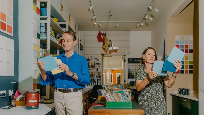
For those determined to preserve the midcentury essence of their Golden Lane apartments, or pick the most suitable colour for their Victorian wrought-iron railings, all roads lead to Papers and Paints. The DIY shop on Chelsea’s Park Walk is staffed by a team of experts in colour history and its sample cards are organised by era, from the pale stone shades favoured by 19th-century decorators to the “purple pop” and “hot mustard” colours of the 1960s.
Now in its 65th year, Papers and Paints opened in 1960 as a typical decorating supplier, albeit one where the founder, Robert Baty, would mix custom formulations to match paint flakes customers brought in, all the while counselling them on colour choices. “My father had accidentally created a niche as a sort of thinking man’s paint shop,” says his son Patrick Baty, who joined the business in 1980 and still runs it today with his wife, Alex.
Soon after joining, Baty noticed a recurring theme. “People would come in with requests for information about the colours of the past,” he recalls. It might have been the tonal preferences of neoclassical architect Robert Adam (“psyche” green and dusty “hebe” pink) or the interior design of the Forbidden City, Beijing’s Imperial Palace complex (centred on a bright “Moorish red”). Determined to assist his father, “rather naively”, Baty decided to find them answers. In 1991, he began a research degree, investigating the colours used around 17th- to 19th-century English homes. In the archives at Scotland’s Register House, he came across a brown envelope filled with handpainted colour samples from 1807. “It was amazing,” he says, “like finding a Dulux colour card in 200 years’ time.” He used the samples to form the shop’s Traditional Colours range, which boasts shades of “sage”, “peach blossom” and “straw”. Major paint companies followed suit with their own heritage collections, based on historical narratives he describes, slyly, as being “somewhat mythical”.


Before Baty had completed his studies, he was approached by the National Trust to assist with the restoration of the Dutch‑style stately home Uppark. A stream of consulting projects followed, among them Tower Bridge, the British Museum, Kensington Palace and the V&A. For each, Baty uncovered the buildings’ original wall colours as well as the various schemes that followed. And so, based on his research, Papers and Paints added new ranges for the ’20s, featuring pastels such as “shuffle blues” and “cloche pink”, ’30s, including “smoke” grey and “metropolitan” red, and ’40s “camouflage colours”, which are surprisingly popular in modern kitchens. The project came full circle when Baty created a 1960s collection based on the shop’s earliest records.

Today, these shades are displayed in the narrow west London shop, its off-white and “fenching blue” (a soft grey-green) walls mostly obscured by colour charts. All of the shades are available in finishes including gloss, matte and eggshell (from £60 for 2.5l) with a £40 surcharge for mixing a bespoke colour. An important part of the shop’s service is colour matching. Customers can bring in a scrap of wallpaper (or a Victorian stable door, book jacket or set of Tibetan prayer flags), and staff use a spectrophotometer, a measurement device that allows for perfectly accurate colour matches, to search through the database of hundreds of thousands of colours, built from decades of other customers’ requests. The staff’s expertise is unparalleled: one former employee was headhunted by Apple to work at its Silicon Valley headquarters.


Visitors range from local tradespeople and DIY hobbyists to interior designers such as Ben Pentreath and Kate Guinness. Over the years, the shop has welcomed Superman actor Christopher Reeve and businessman Angus Ogilvy (hoping to surprise his wife, Princess Alexandra, with some fresh decor). The requests they hear are delightfully diverse. One customer transported a small quantity of yellow earth from behind a waterfall in Penrith and had it matched in masonry paint to bring the palette of the Cumbrian landscape to their London townhouse.

With the historical collection complete, Patrick and Alex, who oversees the day-to-day running of the shop, collect colours on their travels; a typical example, “French Exterior Colours”, mimics the colours used on antique wooden shutters. Meanwhile, Baty dedicates his time to an array of consulting projects. That could mean a visit to the Hogarth stairwell at St Bartholomew’s Hospital, where he chose a stone colour for the ceiling and cornices to cohere with the artist’s murals, or Kew Gardens’ Palm House, where his discovery of a piece of ironwork that had escaped stripping revealed that the famously white glasshouse was at one time a dark, fern green. “As I walk around the West End, virtually every hundred metres there is a building I’ve worked on,” he says matter-of-factly. “But I still get a buzz because there’s always something new to learn.”
Papers and Paints, 4 Park Walk, Chelsea, London SW10; @papersandpaints


